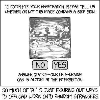
By now almost everyone has had to take Google’s "I’m not a robot" test. This often involves identifying driving scenery. XKCD brilliantly notes that Google is also pioneering autonomous vehicle technologies and hmm….
Here’s one I had today.
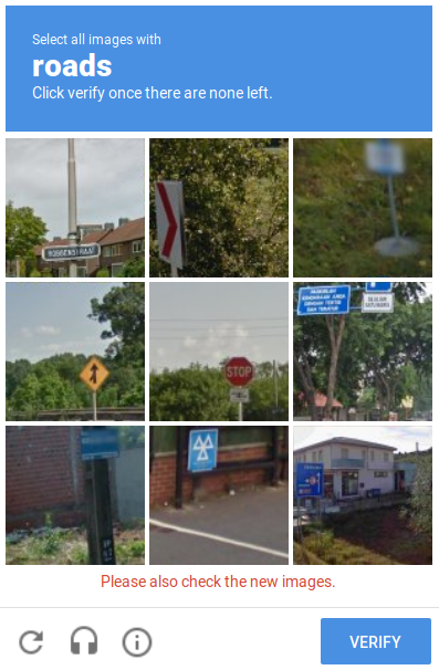
They insisted that the bottom center needed to be clicked as a "road". Although I totally am not a robot, I did not concur. Parking for a nuclear powered car maybe? But not a road. Opinions differ. This stuff is hard. Even so, is it possible that a robot actually could pass this kind of test? I say yes. At least most of the time!
Remember when I mentioned a sign classifying project I did for last year’s grand educational campaign? The project was to build a neural network that could classify traffic signs, that is, select which sign was being shown in a small photo. Looking at the photos provided for training made it clear that there can be a lot of messy problems with the quality of the images.

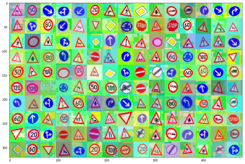
What really shocked me was when I happened to look at the training set in order. Here’s what that looks like.
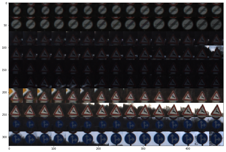
I realized that these images were collected by analyzing driving videos. The problem with this is that it radically compromises the efficacy of the training set. What it would seem to train the system to do is recognize (and ignore) small frame to frame mutations. This is hardly an ideal set of sign images for training a classifier.
I had the realization that this project could be greatly enhanced by thinking about it in a completely different way. There is no need to train a classifier to learn what different signs look like. We know what the signs look like! We know because they are the way they are by definition. If they are not within a defined specification of the Bundesministerium für Verkehr (traffic ministry) they are not the sign!
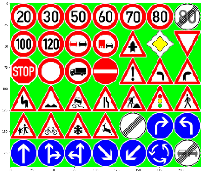
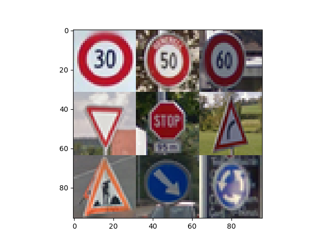
Looking at the German Traffic Sign Recognition Benchmark web site, I found a collection of decent quality representations of canonical, by definition, German traffic signs. I downloaded these 43 images (one for each type of sign) and edited the borders with a marker color (so a white face would not be confused for a white off-sign region). This allowed me to do chromakey substitution to put these signs in contrived situations. Although we can make arbitrarily high quality versions (because we know the theoretical definition of a perfect sign), here are what low resolution ideal signs look like before any other processing.
Since we know what the signs properly look like (and can tell a computer exactly what that is), the trick really is to figure out what we do want to train the classifier to look for. What we really wanted the classifier to do was learn to be invariant to (not notice) things like scale, rotation, lighting, backgrounds, and perspective. To help train the classifier, I created a program that used OpenCV to randomly morph the canonical image set into some more diverse images. It takes the canonical images and applies the following transformations.
-
chromakey - replaces the "green screen" background with something else.
-
cluttery background - fills in a random number of random shapes of random colors.
-
gaussian blur - this blurs the synthetic images to a random degree.
-
affine rotatation - rotate the images a random amount.
-
perspective warp - change the image perspective to a random one. Simulates obliqueness.
-
hsv mangle - changes the overall color and saturation of the image.
-
smallify - all of this is done to original high quality canonical images and then reduced to 32x32.
Here are some examples of completely synthetic images that I created from nothing but the knowledge of the Platonic ideal for each sign.
I tried to use this as my training set and it was interesting to note that I could classify 25% of the real image test set correctly using absolutely zero real training images. (For 43 sign types we’d expect a completely brainless random classifier to get about 2.3% right.) That’s interesting and a good start, but clearly that is not a complete solution. I actually believe I could keep working on synthesizing these images until I became really good at it. For example, there does seem to be a lot of green; I may not have replaced my chromakey as I had intended. Fixing that and 1000 other things I can imagine could be done, but there was a more expedient way.
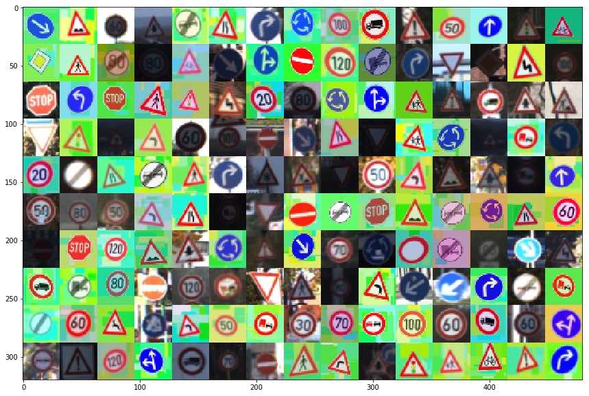
The next thing I tried was to combine my synthetic images with the real training set. The idea was that the synthetics would train the classifier to really understand the signs themselves and the real training set would help it understand that everything else (lighting, color wash, etc) were ok to ignore. I basically added a synthetic image for every real one effectively doubling the set. Here’s a sample of the training images I ultimately used.
By being able to synthesize my own images I could play with different infusions of synthetic images. But since that’s yet another of literally thousands of knobs I could be tweaking (and waiting 10 minutes to see the effect of) I only did rough testing of this. There was clearly no point to using a much bigger training set of these synthetics, but they did contribute quite decently when doubling the normal training set.
Speaking of thousands of knobs to tune, there are literally endless permutations of ways to configure the deep neural network architecture. I wish I was some kind of super genius who could purposefully make changes to the suggested architecture and correctly anticipate a beneficial effect. Alas, I’m just a normal person and I’m not especially lucky. This means that the dozens of modifications I did try to the standard LeNet-5 architecture produced effects that were deleterious or, more often, completely catastrophic. I added layers, changed sizes, tried different activation functions, tried different optimizers, and changed the learning rate, the batch size, and epochs dozens of times. Again there is a riot of knobs which can be tweaked and I’m sure lucky people obtained great results by doing that. For me, the only helpful thing that I deliberately did differently from the way it is normally done is to supply the synthetic images.
One generally unmentioned problem that I’ll go ahead and mention is that one of the best ways to see a dramatic increase or decrease in model performance was to run it again. Yes, with the same parameters! The random fluctuations make homing in on some subtle improvement very challenging. Again, being lucky would, no doubt, be very helpful.
Eventually for the supplied photo images I was able to get a reliable test accuracy over 90% (and a validation accuracy of 93%). The real test would be to get some new photos from the wild. In acquiring new images to test the obvious place to look is Google Maps Streetview. However, I believe that Germany has created privacy laws prohibiting Google from deploying Streetview there. I am however personally familiar with much of Switzerland and they do not have this problem! Since they share similar signage with Germany, I (virtually) went through places in Switzerland I know looking for signs.
In this way I obtained 9 interesting novel sign images. Here are the versions I submitted to the classifier.
The 60kph, right curve, and roundabout sign all are quite oblique (not directly facing the camera). The road work sign is not even a sign, but a temporary marker with some confusing parts from its third dimension. There is a good variety of backgrounds. Some have geometric artifacts, some just random noise, while some are quite clear. I feel there is a good sampling of colors and shapes in this set. Here’s what my classifier thought of these novel images.
| # | actual | shape | bg | oblique | best guess | 2nd guess | notes |
|---|---|---|---|---|---|---|---|
1 |
50kph |
round |
random |
slight |
50kph(100%) |
30kph(0%) |
round speed signs in top 5 |
3 |
yield |
V-tri |
shapes |
none |
yield(100%) |
priority(0%) |
#2 is a yellow diamond |
7 |
keepR |
round |
shapes |
none |
keepR(100%) |
rndabt(0%) |
#2 also round with blue bg |
8 |
rndabt |
round |
random |
serious |
rndabt(99%) |
30kph(1%) |
amazingly good for such oblique |
4 |
stop |
oct |
random |
none |
stop(95%) |
no entry(5%) |
#2 is round and red with a white middle |
| # | actual | shape | bg | oblique | best guess | 2nd guess | notes |
|---|---|---|---|---|---|---|---|
0 |
30kph |
round |
clear |
none |
70kph(90%) |
30kph(10%) ! |
round speed signs for top 5 |
6 |
worker |
tri |
clear |
medium |
X80kph(92%) |
worker(4%) ! |
not even a proper sign but a temp sign |
5 |
Rcurve |
tri |
random |
serious |
child(43%) |
pedxing(18%) |
Rcurve(10%) was 5th, ie very uncertain! |
2 |
60kph |
round |
shapes |
medium |
50kph(60%) |
80kph(21%) |
60kph(0.2%) was 5th |
I don’t think that the overall accuracy (~50%) is very relevant. I could have cherry picked easy images. The sample size is tiny. Some had known problems. Etc. Etc. What would be interesting would be to see if different cropping or image processing steps on these could improve them. But to treat them all fairly this was about the best I could expect. I’m pleased with the performance.
The only non-oblique sign classified incorrectly was the 30kph. I don’t know why that is exactly since it was actually an ideal image (maybe too perfect?). But I can see how it could be considered very similar to the 70kph sign which was its first pick. I think that oblique signs could be improved if I increased the parameters which set the severity of the perspective transform in my image synthesizer.
Back to captchas… I’m doing a pretty good job of choosing which one of 43 signs is being shown. The captchas only ask to say if there is a sign present or not, a 50/50 guess. You can see that getting that to be significantly higher would not be a terribly hard problem. So Google, maybe I am a robot!