Inspiration
At first we started by each coming up with a long list of brainstorming ideas for what to do with our entry. From about 30 ideas, the one we most liked the sound of was this one on my list.
Hand catches ball, hand dies and falls to bottom, disintegrates into skeleton hand and releases ball.
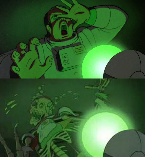
I guess I was trying to think of other works where the main character was… uh… a sphere. The first thing that popped into my mind was the Loc-Nar from the 1981 animated (but not for kids!) movie Heavy Metal. In that film, a sphere, called the Loc-Nar, passes from one disparate animated story to another as sort of a loosely binding plot element. (Hmm, sounds familiar!) Encounters with the glowing green Loc-Nar generally resulted in death, often by accelerated disintegration. Here is an example clip of this action from the beginning of the movie.

Having the ball do some kind of Loc-Nar attack seemed challenging, yet doable, and we felt it would be a unique effect that wouldn’t be like thousands of other entries.
We started by checking a prototype to make sure we really could do it. Once we saw a proof of concept of our hand rotting away, we did more careful brainstorming about what kind of theme this kind of effect could serve and the exact layout of the scene. The fact that E was keen to use a painted render style and seeing our prototype on a barren dark background, I was reminded of Dutch still life paintings.
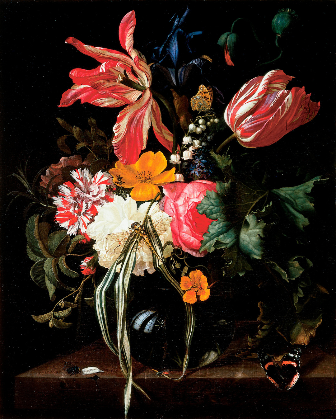
One specifically was Flower Still Life by Maria van Oosterwijck which hangs in the Cincinnati Art Museum.

I’ve always loved this painting and am always amazed every time I see it in person — it is shockingly clear and crisp. Painted in 1669, I’m also blown away by how vibrant and perfect the paint still looks today. Besides flowers, note the black background, the slab, and the spherical reflection - this was definitely an inspiration for us!
This is hardly the only Dutch classical work I’ve seen with a dramatic inky black background and I knew I’d seen plenty with skulls; I wondered if that style could work for us. And that’s when I found the whole 17th century meme of vanitas.
Theme
What is "vanitas"? Here is what Wikipedia says:
A vanitas is a symbolic work of art showing the transience of life, the futility of pleasure, and the certainty of death, often contrasting symbols of wealth and symbols of ephemerality and death. Best-known are vanitas still lifes, a common genre in Low Countries of the 16th and 17th centuries; they have also been created at other times and in other media and genres.
Perfect! We were keen to add another media and genre! If Lemmy can do this theme in spoken heavy metal poetry, we can do it in computer graphics!
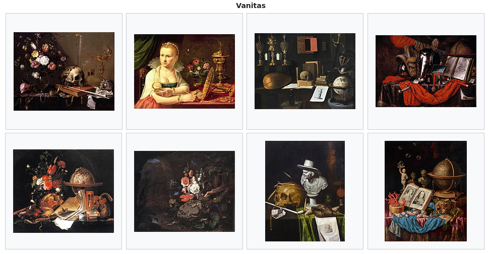
Here is a small collection of vanitas themed paintings that Wikipedia
thought might elucidate the concept.

This one deserves special attention as it includes a conspicuous chrome ball!

The vanitas theme definitely looked promising for our project. But isn’t it kind of emo? I actually don’t look at it like that and I am not sure rich Dutch art collectors did either. It’s more of a reminder that no one has ever said, "Oh that guy has way too much humility!"
Humans and animals become afraid when something scary is going on, but the ability of humans to make little virtual world stories to weave into the content of absurdly rich communication faculties means we can think about serious problems in the abstract. Things can be going great, and yet we can entertain a virtual mental model of dying — of being dead. I believe that is a very human ability. This kind of abstract foresight theme is an interesting byproduct of that one weird cognitive trick — consciousness — that makes us humans the most fearsome creatures that ever lived.
Ah… But vanitas lets us not get too ahead of our real reality.
So it is a beautiful and dramatic classical idea and once we caught its scent, we were on it. We decided to base our animation very faithfully on a 350 year old (1671) vanitas painting by Philippe de Champagne titled "Still Life With A Skull".
We chose it because it has a less cluttered prop collection than a lot of still life works. The patron commissioning this work really wanted to boil it down to the essentials - life, death, and time. We already had the skeletal element (even if the skull is only implied just out of the shot). The hourglass seemed like something neat could be done and the austere single flower was a lot more approachable than the explosion of color in van Oosterwijck’s work.
Script
Once we had the theme and concept worked out, I wrote a full script for it. Perhaps a bit silly for a 15 second movie, but we wanted to plan our limited time as well as possible.
This overall theme is based on the 16th/17th century Dutch vanitas theme showing the transience of life, the futility of pleasure, and the certainty of death. This fits quite well since the cycles of life and death are apparent in the contest format of one entry after another.
Our scene opens with the top of the box rising into view delineated with an ornate gilt gallery-style painting frame heavily decorated — at the top — with iconography of life and vitality.
Immediately visible is a stream of sand pouring out of the box ceiling (where the contest ball is proscribed to drop). As the camera continues to pan down we see a hand reaching up into the stream of sand feeling its flow over and around the fingers.
Suddenly, and all too soon (at a point convenient for framing our scene perfectly), the sand stops! The hand subtly flattens quizzically. As it reaches up to investigate, the chrome ball drops into the hand.
The hand is surprised and reacts to steady the ball and hold it. But all is not well! The ball is causing rot where it sits in the hand and the rot quickly spreads outward from the ball. The hand recoils in horror but quickly goes limp, the flesh dissolving from the bones as it falls to the floor of the scene.
The floor of the scene rises to the center of the shot showing props deeply referencing specifically Philippe De Champaigne’s Vanitas painting: an hourglass on the right and a tulip on the left. The skeletal hand lies limp front and center on a stone slab exactly like the plinth found in the painting.
As the last of the flesh is eroded from the skeleton, the ball, still in the palm, is freed and allowed to resume its inexorable journey. As the ball rolls toward the hole, the bones start to dissolve to the same sand that we saw in the opening shot. As the ball leaves, our shot is barely in frame and our bone dust can swirl around headed for the hole.
The final goodbye is the bottom of our classically inspired gilt art frame which — at the bottom — is decorated with tree roots, a buried skull, broken armor, and other classical iconography of death and decay.

