As you might recall, back in July EE and I worked very hard to create a unique and high quality submission to the Dynamic Machines computer graphics animation contest. Our web site for that is here.
After several weeks, the "results" were finally released. They were kind of disappointing as we knew they must be. The problem is that instead of being judged by a panel of computer graphics experts, it was judged by one guy whose opinions mostly do not match mine. I’d say that to reliably make a random judge’s top 100 list you really need to be in the top 20 overall as judged by a group of experts. In other words, to ensure getting picked, you must have a project so outstanding that nearly everyone considers it universally brilliant.
There were definitely twenty projects much better than ours! As you might expect, I thought that our project was pretty good, but of course one never knows how some random guy will feel about it. And we still don’t really know; we just know it didn’t make his official "top" 100. Putting our project aside (maybe it was #101 or actually terrible, doesn’t matter really) what I was really disappointed with was how many amazing and deserving projects were overlooked and basically thrown in the trash heap. This did not seem cool to me.
To honor and learn from all the amazing artists who participated, I set out to properly look at all of the entries and make my own decisions about them. With 1900 submissions, this was a much bigger undertaking than I had imagined. And in the end we just have another random guy’s stupid opinions. If you participated but I didn’t highlight your entry, don’t feel bad — these were all of such quality that I’m sure you’re on someone’s list of favorites.
As much as I really enjoyed working on our original submission and seeing all the entries, there was a ton of room for improvement in the contest format. Such collaborative events are really cool and have so much potential but I was very annoyed by many details.
First, there should be better exposure for some of these really great projects. I don’t know exactly what the answer is. Maybe some kind of subcategory awards. Maybe by country or state specifically. Maybe give some attention to the top 200 or top 500. Obviously some kind of community voting mechanism would be ideal — maybe give each person who submits a valid entry 10 votes. And for all 1900, it would be polite if the artist’s contact information (generally a link to their portfolio) was conveyed just as they are for the chosen 100. There are some entries that I’d love to contact the artist and congratulate them on an amazing entry and ask how they did it, maybe see their other work and help out their stats.
The obvious improvement is to have a panel of judges. To have one colorblind (not even kidding) guy with three whole years of experience saying what’s good as the voice of the whole CG community is probably not ideal. And this is a big deal. I noticed that this "top" 100 video was being recommended in all kinds of diverse places. It currently has over a half million views and will probably just keep accumulating hits for years to come.
Speaking of YouTube, that platform is not necessarily ideal. I ended up downloading the entire video (hint: youtube-dl is great). That allowed me to get full exact native resolution and consistent full frame rates — that makes a huge difference! These scenes are packed with underappreciated details that YouTube’s rough handling can obscure, especially if you’re watching it scaled down.
The soundtrack of the compilation videos was a crime. We mourned the life-hours lost by so many artists who lovingly enhanced their projects with a soundscape only to have it obliterated by the abject stupidity of the organizer. This is inexcusable and I’m not happy about it. I suspected when I worked on my sound design that this would happen and it’s not so important for our project, but there’s a whole category of musical scenes and the music has been replaced with something completely wrong and awful. WTF was he thinking? Note that the same organizer who ruined these entries was the same guy who said, (and I am quoting verbatim) "Sound design is highly encouraged." Why do that? Super uncool. I had to mute the whole obnoxious thing it was so terrible (the hot key is "m" in a Youtube player if you need it).
In my opinion, the whole concept of a ball rolling through a Rube Goldberg contraption was set up to be somewhat boring. Ten scenes of that might be cool. Twenty tolerable. But we’re talking about 1900 here, 3.5 hours! Thankfully the massive creativity of the community mostly rescued it. I wasn’t the only one to feel this way. There were about three entries that we very much liked that went through the whole Rube-Goldberg trope very classically staged, but then subverted expectations by having the contraption break and fail comically, illustrating how that was actually much more satisfying. (e.g. tom_d 0:29:06).
Beyond the obvious and somewhat reasonable cliche that the organizer envisioned, I was surprised by how many weird tropes emerged. If your entry included one of these, it could have been brilliant in every way except for one: originality.
The first weird tropes were from video games. In our project planning, I personally thought of Donkey Kong but quickly dismissed it as too obvious — it turns out, correctly. Minecraft will always have a mob of enthusiasts (I’m one) who will craft something in that theme. But the one I found really weird was Portal. Portal is a fine game, but somehow it caught the imagination of many artists who thought this project’s concept reminded them of Portal. I found those entries to be generally confusing to watch. If you’re going to use a video game (including Legos) theme, you need to make sure it is more interesting than just playing the game! It does not seem wise to compete with the likes of Legos and Disney.
Here are some other tropes that emerged that I noticed: bathrooms, showers specifically, kitchens, fridges specifically, pinball, claw machines, ferris wheels, rope bridges, balls fired from canons, lab experiments gone wrong (e.g. 0:45:18 john_w), alimentary tracts, basketball hoops, ball heating to glowing red or melting, ball inspection, desk tableaux (especially a character interrupted at their desk), parking garages, the internal components of desktop computers, and ants.
Some of these were just fine. The ball inspection scenes for example, were almost all extremely well done. Some common themes surprised me, for example ants, because I would have thought that was a safely original theme. However, even we considered it.
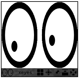
I’m sure the people who stuck an eyeball on the wall thought that was very quirky and unusual. I actually liked the effect (as when I first saw it in the early 1990s with unix’s xeyes) and most of those entries were high quality, but, uh, nope, not as unique and creative as you might think. That was done quite a bit including by the entry that won the over all grand prize! (Ahem.) Can you identify it?
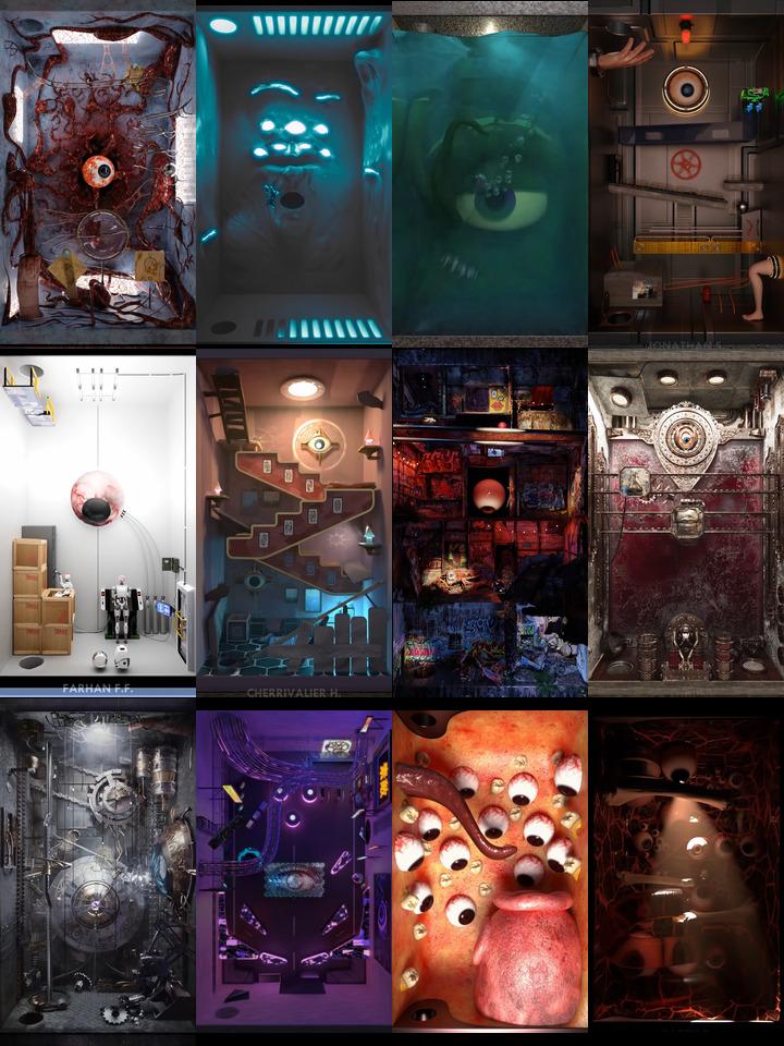
Many projects featured random assets downloaded from somewhere and some started to become familiar. One that stood out to me is the nixie tube; I may be the only person involved who has actually used old equipment with this numerical display technology.

Speaking of antiquated people and technology — the gears!
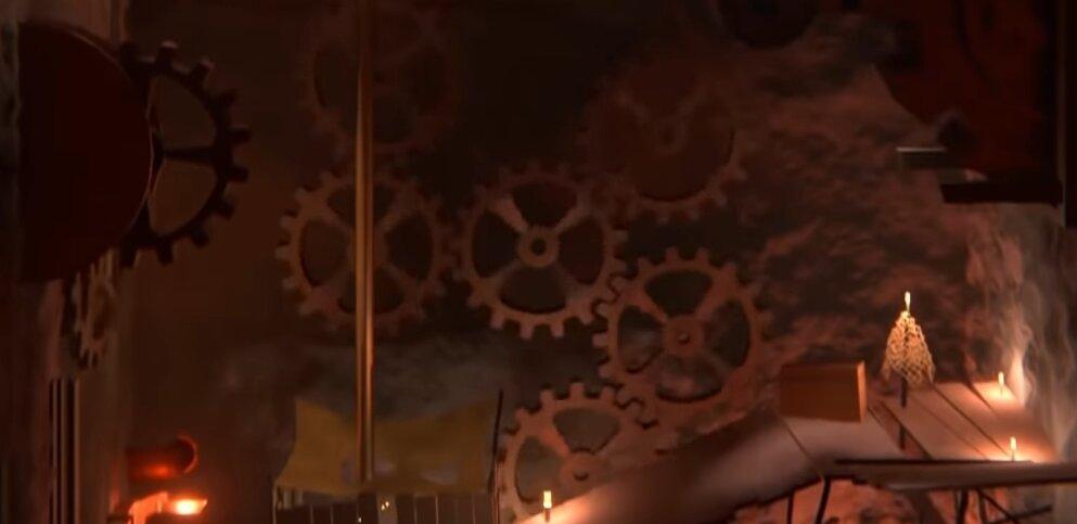
I counted 126 projects using dysfunctional or mostly pointless gear trains. There were some decent ones though, for example: 0:37:25 sajith_a and 2:28:55 jose_a.
There were also rendering style cliches. Neon was the big one - it is simply so damned effective that it is massively overdone. Brass and gold metal were everywhere reminding me of the materials available to rendering engines of the mid 1990s. The same with marble and granite.
Legos were also a very common trope both as a theme and, I think when properly considered, as simply a rendering style. Many of the Legos projects had nothing to do with Legos the toy. They just were random scenes rendered in Legos style.
My least favorite common theme was personally pandering to the judge. I
understand that maybe he has a legitimate fanbase who are excited to
promote his brand and the contest itself — just as I was happy to see
entries that gave a deserved hat tip to
Blender. However, I can’t help but feel that
by putting his image and branding in their projects it seems like an
effort to curry favor, which seems a bit cheaty. (An egregious example
at 00:33:33.) Also bewildering and disturbing were the ones featuring
outright product placement. What’s the deal with the advert for a
telephone brand at 0:37:24? Then there were ones that might have been
just favorite brands of the artists so I’ll just try to ignore them
(1:44:11, 1:19:10, 3:11:33). Seriously, using youtube-dl and
skipping ad interruptions kept me sane.
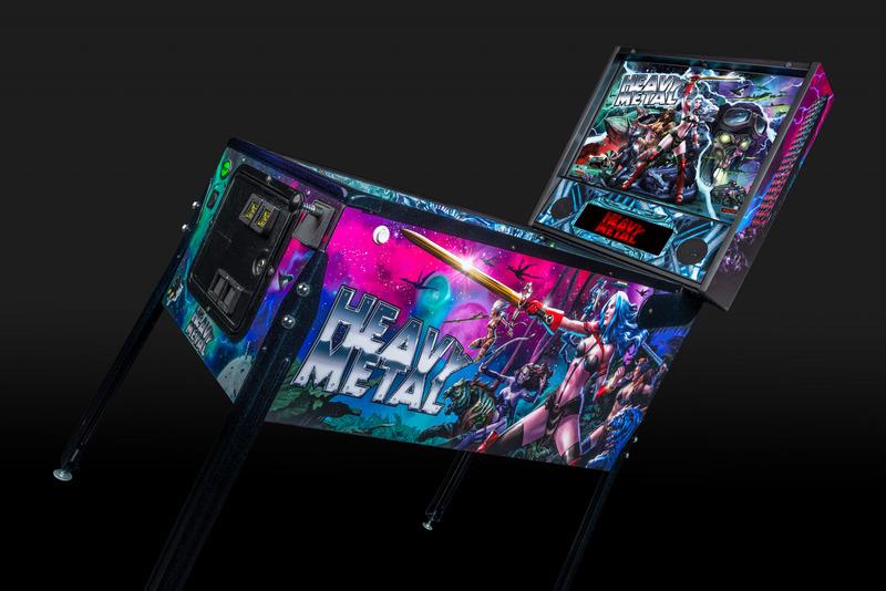
One trope that I expected turned out to be completely missing: the Loc-nar! It is incomprehensible that a huge cult movie (that inspired the recent Emmy-award-winning brilliant Netflix computer animation showcase, Love, Death & Robots) got not a single reference as far as I could tell. That film from 1981 (the same year as the highly represented Donkey Kong) was Heavy Metal. In that movie, the binding theme was the antagonist, the Loc-nar, who literally is a sphere which passes through disparate animated scenes. I thought it would be done to death! (No pun intended there.) Not even a Heavy Metal pinball machine! Well, one project at least gave the ball the Loc-nar’s character!
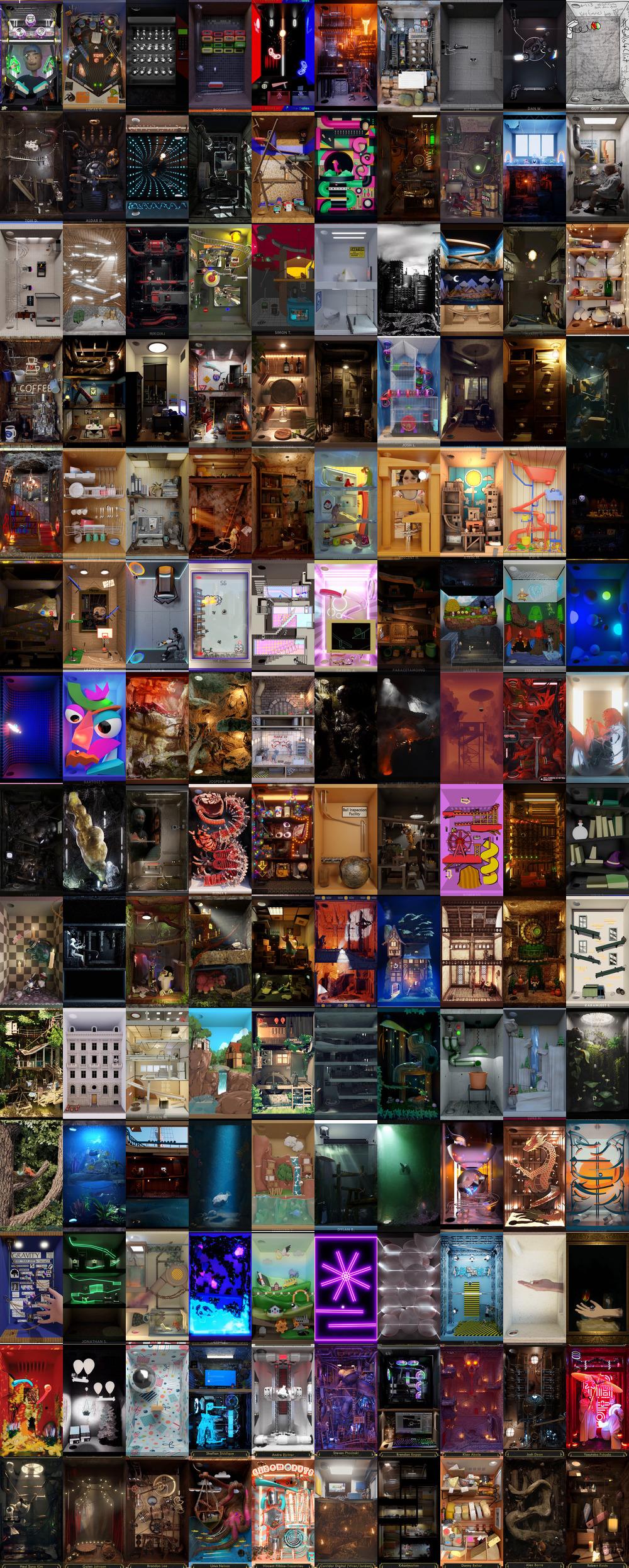
Well, that’s about all I have to say/rant about the contest such as it was. Instead of immediately sending you off to the official videos I wanted to do something hopefully helpful and interesting. I went through the full set and highlighted entries I personally found interesting and worthy of attention. I then wrote a program to allow me to extract its middle frame. I then spent way more hassle than I’d planned and created a web site to show them off.
Given the tricky portrait orientation, it’s hard to figure out how to best display these, but my goal was to let you see the full resolution. If you’re using a monitor that is less than 1920 pixels tall, you may want to open this in a new window and resize it to be tall and narrow until it fits on your screen. If you have a big (4k+) monitor, it should be fine. Note that there are previous and next buttons below the image. I put them there to keep them out of the way in case the image was just barely fitting.
These are in order of how they were presented in the main full video. After rewatchting the 100 video, I found some more that I did think were deserving of the attention they’re going to get — they are at the end.
Anyway, I found it very useful to study these still shots from the scenes. If any are intriguing you can open the main video cued to that entry with the linked timestamp in the upper left.
Open a new tab and check out my web page highlighting and annotating my favorite entries.
Note that I really do think all entries were fantastic. The amount of talent on display here is astonishing. I had some heuristics that I judged from (e.g. the somewhat objective property of being unique) but that’s just my opinion. Your opinion might be quite different from the organizer or mine. After looking through my still collection, I encourage you to watch the whole thing. I would strongly advise starting in the middle, not the beginning. This will let you skip over dozens of repetitive video game recreations and get to some more diverse stuff. The 2 hour mark is a good place to start. If you manage to make it to the end, start at the beginning and watch the rest.
Here is the main URL for the official video of all contest entries: All 1900 entries 3.5 hours!
If you finish watching all of that and are really curious which ones the organizer picked, you can find out The 100: here.
I spent a lot of time working on our entry and also studying the other entries. So much time that it is a bit unnerving. However, I must say that I have learned an incredible amount from this experience. Scrutinizing hundreds of very high quality scenes has been very educational. I don’t delude myself about my chances of ever putting this knowledge to professional use, but I enjoy this kind of artwork so much that it has been totally worth it just to improve my skills recreationally.
I remember when I was in high school, I went down to the local university’s art school to see a screening of a short collection of a handful of computer generated animation videos — maybe it was a SIGGRAPH thing. It was definitely mind blowing state of the art. We got to see maybe 15 minutes of computer animation at a time when having any kind of image on your computer meant painting it yourself by hand. I was absolutely blown away and I remember thinking that was the kind of future I wanted to be a part of. Now I am!