The bad news is obvious, right? It’s everywhere. Plague! House arrest for everybody! Great Depression or Greatest Depression Ever?! Riots! A president who once savagely beat a puppy to death with a golf club. (Actually, I just made that last one up — but what is worse, that false "fact" or a president who doesn’t mind citing such flagrantly false facts? Feel free to make up your own "facts" about the president — he doesn’t care!)
Enough has been said about the bad news. I want to focus on the good news. Before that can make sense, however, we need to consider the ugly news — the news that makes no sense and is a muddled mess. Unfortunately, that has been literally all news about the details of this pandemic.
Here’s a prescient article from March 17 - A fiasco in the making? As the coronavirus pandemic takes hold, we are making decisions without reliable data.
It starts with this.
The current coronavirus disease, Covid-19, has been called a once-in-a-century pandemic. But it may also be a once-in-a-century evidence fiasco.
At a time when everyone needs better information, from disease modelers and governments to people quarantined or just social distancing, we lack reliable evidence on how many people have been infected with SARS-CoV-2 or who continue to become infected. Better information is needed to guide decisions and actions of monumental significance and to monitor their impact.
That was back in March. Plenty of time for everybody to start to figure out what sensible data looks like. And yet, it never came! Every day there would be some fatuous headlines like these:
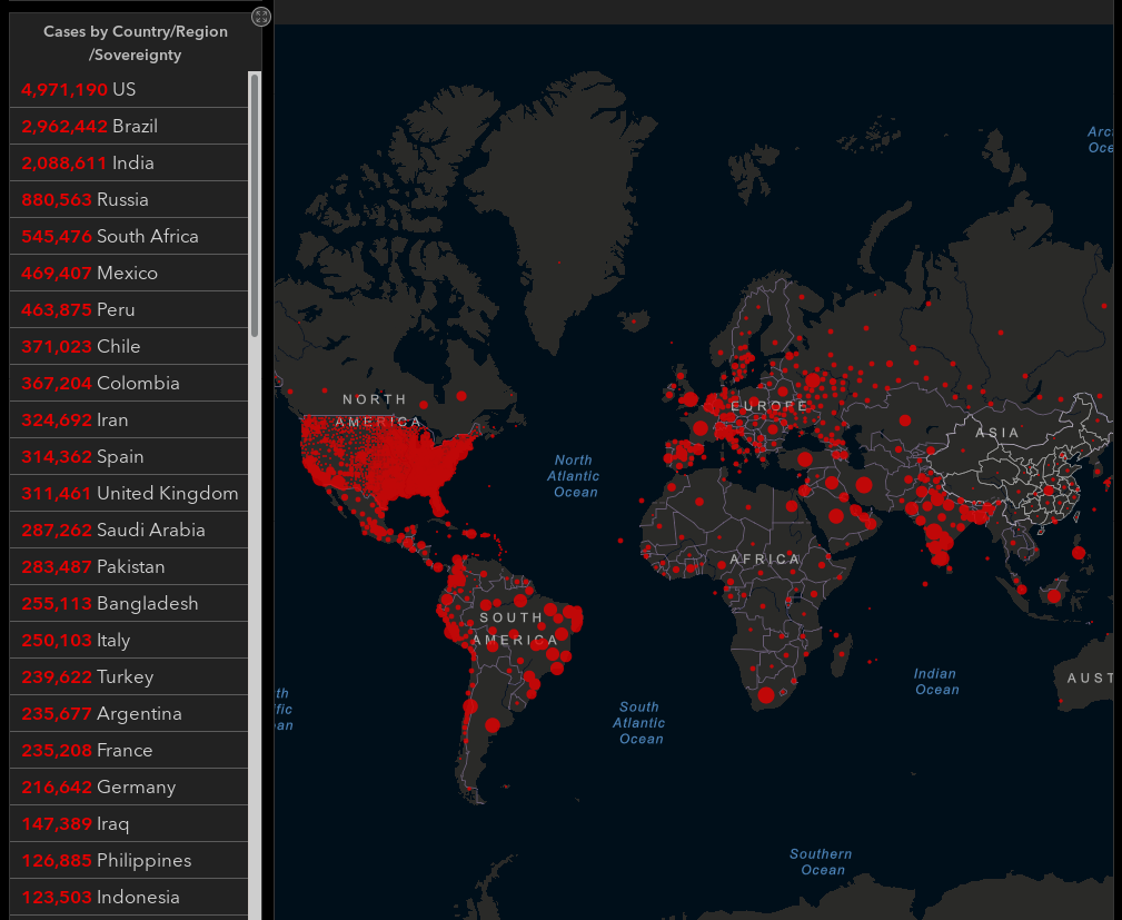
The Johns Hopkins Coronavirus Resource Center interactive map is a complete joke, gormlessly hinting that Germany is twice as dangerous as Indonesia.

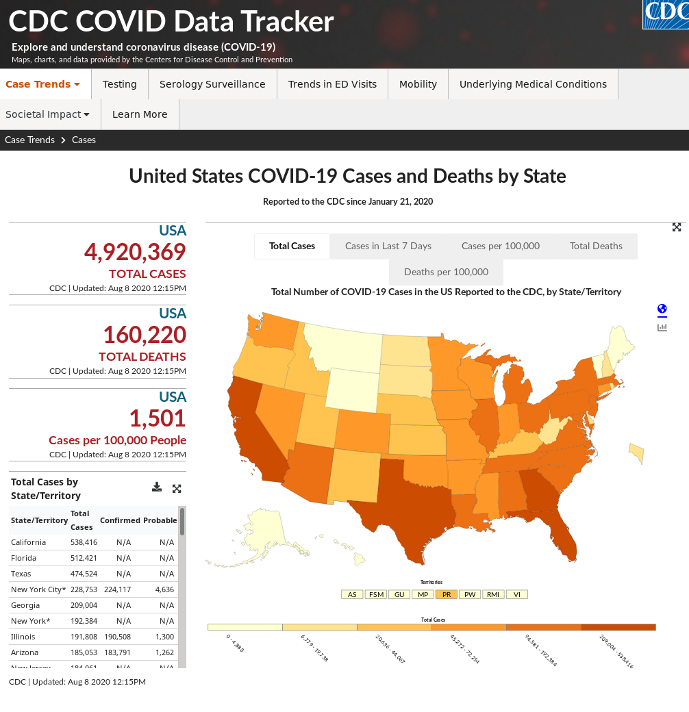
Another grand example of terrible data is the CDC. Check out their CDC COVID Data Tracker.

The default that comes up is "Total Cases". What is so stupid about this? Imagine a prolific creator of false facts using this "data" to "manage" the pandemic. First of all one can have fewer "total cases" by simply nerfing testing. But a really accomplished false fact artiste would say something like, "COVID-19 cures most natural causes of death! Just look at how the population is thriving under the therapeutic influence of this wonderful virus. Which was my idea by the way." Go on, look at that "data" in the CDC chart and tell me how that claim can be refuted. It can’t.
That’s the ugly news. I feel like I have been watching an endless game of Numberwang.
But I have seen a glimmer of hope! Let’s turn now to the good news.
Back in March, some rando on the internet — who also happens to be a faculty member of the University of Cambridge’s Risk and Evidence Communications unit — wrote a sensible article about How much normal risk does Covid represent? The answer, summarized, was that your risk of dying pretty much doubled.
The way I would explain that is to imagine playing Russian roulette with a six-shooter that had two bullets instead of one. If your gun had 800 chambers (equivalent odds for a normal person in their 30s), going from 1 bullet to 2 wouldn’t be quite so problematic. Note that everybody’s gun gets smaller as they age.
My real point there was that article way back in March was the last example of good data considered sensibly that I have seen during this entire mess — until today.
I feel too financially insecure to afford The Economist, but I do get their email newsletter and sometimes their content is not paywalled. Today they tipped me off to this unusually clear and cogent resource.
Stare at this and soak it in and you’ll understand what is wrong with all other sources.
The first thing to notice is they’ve cut through the bullshit of bullshit testing. The last time I saw such a muddled testing situation was either standardized academic testing or maybe even IQ. Testing sensibly for Covid pathologies and dangers is even worse than normal CYA medical diagnostics. This data from The Economist understands that and moves on to what can be sensibly inferred about the situation.
If we stop and ask ourselves what we care about, number one on the list is not getting killed. So The Economist asks the simple question, are we getting killed more than normal? Don’t worry about why. It could be people dying of asbestosis because masks are hard to acquire for construction work. Doesn’t matter. Step one is to answer the question - is there a problem? And The Economist’s methodology is so simple that it’s actually plausible. They simply look at how many people used to die and how many people are dying now and see how/if that has changed.
That’s so simple, but really it is a relief to me that someone is looking at this in a way that is not deeply flawed to the point of being meaningless. They even have a nice Github repo with all their data and scripts if you’d like to quibble with their methodological details. (For example, I would make minor adjustments based on natural changes of population, but really, not strictly necessary to appreciate these numbers as better than anything we’ve seen thus far.)
It is "good" news in the sense that it is of good quality. It is also good in the sense that it looks pretty good. I am not terrified by this data.
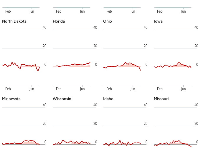
At first I misunderstood the "Absolute" setting on the graphs to mean they were like the fatuous CDC data. But really this data is much more useful. It is not showing absolute deaths - which no one really cares about. It is highlighting the validity of testing statistics. The difference in Covid-19 attributed deaths and real deaths is directly measuring the effectiveness of the testing programs. They are frankly not as abysmal as I thought — though I live in NY where, like NJ, Spain, Holland, Italy, and non-WEIRD nations, it is pretty abysmal.
It’s interesting to note the negative rates after the spike. The article cautions that some of this more recent data may just reflect reporting lag. My intuition is that many victims were probably close to death anyway and there were less people to die in June if they had their exit schedule moved up to May.

Reports of a "second wave" seem pretty overblown. Again, could be reporting lag, but this data isn’t terrifying me. It’s looking like people got sick, like they do when something is going around. All the vulnerable and unlucky people got it, and it doesn’t really have much more room to cause trouble. That could be a very wrong guess, but this data, real actual data that is not meaningless, is in no way contradicting that assessment.
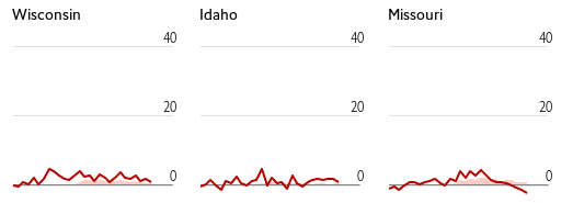
I’m actually pretty impressed that a lot of states really are not seeing anything like what New York and New Jersey saw. Look at Wisconsin or Idaho or Missouri.

I would actually say that the danger for them is greater. It’s greater because to my thinking they have not had the full force of the pandemic come and hit their vulnerable populations yet.
One could make the case that this shows that protective measures, lockdowns, and hygiene theater are working. I’m not sure if there is enough data for that by, say, comparing Sweden with Switzerland. But this kind of data could tell us exactly what works. It’s not testing as I had previously imagined. Testing is almost as elusive as a vaccine; let’s just rule sensible tests out and focus on real and obvious effects.
What really works is simply tracking deaths promptly and accurately like any 21st century society should be doing anyway. With sensibly tracked deaths, accurate studies to gauge the efficacy of various measures are actually plausible, even using "natural" experiments with different sides of the state line doing different things. It would be really helpful to see these plots with the same plots superimposed from other flu seasons and outbreaks.
As one of the early adopters of Covid-19 I can tell you that if you get it, it’s no picnic. (I am feeling a bit better than last month, thanks.) But this data is not only good in the sense of not being stupid; it’s good because it doesn’t show an impending apocalypse. It’s exactly data like this that we need.
UPDATE 2020-08-10
A perceptive reader sent me this NYT article from late May: Putting The Risk Of Covid-19 In Perspective. It tries to focus on the comparative risk side of things. That would be valuable and correct if there was sufficient data to support such aspirations. Note what this article uses for data.
Using data from the [CDC], New York City experienced approximately 24,000 excess deaths from March 15 to May 9, when the pandemic was peaking. … …using the C.D.C. data, Michigan had approximately 6,200 excess deaths during this same time period.
Note he’s not comparing those directly but using excess deaths — the only metric we really have right now — to go on to put the risks into perspective. Excess deaths is finally some data that makes sense.
UPDATE 2020-11-21
I mentioned "natural changes of population" as a minor potential issue with The Economist’s approach. I just noticed that on 2020-10-14 they have made an improvement to their model: "The page now uses a statistical model for each region, which predicts the number of deaths we might normally have expected in 2020. The model fits a linear trend to years, to adjust from long-term increases or decreases in deaths, and a fixed effect for each week or month." Bravo!
UPDATE 2021-02-03
I just learned that the CDC has some perfectly good data hiding deep in its web labyrinth. Check out this site with relatively up-to-date sensible data.
Excess Deaths Associated with COVID-19 Provisional Death Counts for Coronavirus Disease (COVID-19)