Here are my notes for how to create data plots using various tools.
DIY
Here’s a blog post I wrote on how to create pie charts using nothing but simple Unix command line tools.
Here’s a blog post I wrote which incidentally includes a small C program to convert standard input into PNG plots. If you just have billions of numbers pouring in from some source and you just need to see them dumped in a graphical representation, I do not believe it gets any more direct than this approach.
Map Projections
If you have a bunch of GPS coordinates, it’s tricky to get them into a
2d representation. The best tool I’ve found for the job is pyproj
which can be obtained easily enough in Debian with apt install
python3-pyproj.
Projection Geometry
Spheres are non- developable surfaces. You can not represent the surface features of a sphere on a flat map with perfect geometric accuracy. Some how, some way, the geometry from the surface of the sphere must be distorted onto a flat plane. This is usually done by projecting the features onto the plane in some clever way.
There are many, many projection strategies, all with their strengths and disadvantages. Universal Transverse Mercator seems pretty common and reasonable. Here is a helpful beginner guide to unwrapping a sphere using UTM.
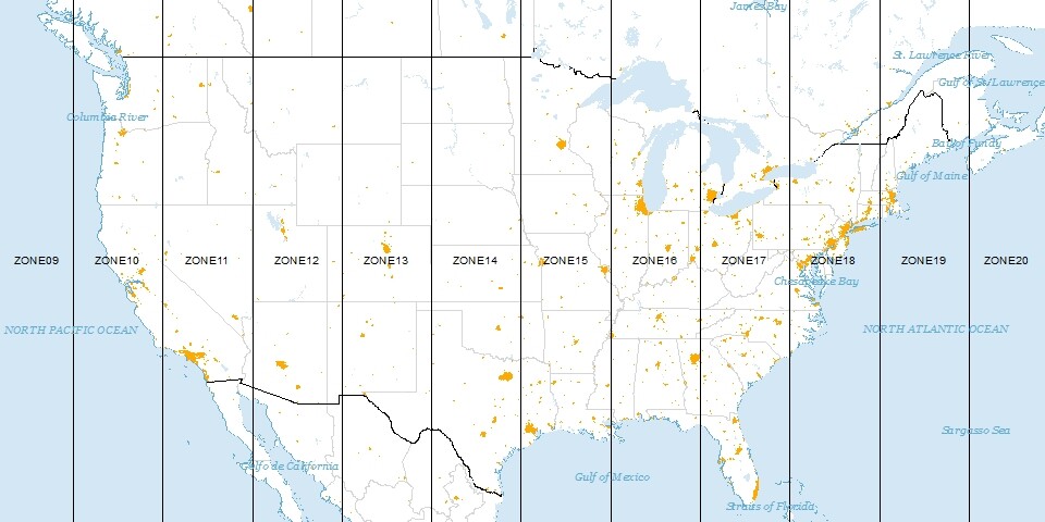
Basically, it’s like the normal Mercator that many people are familiar with where Greenland is huge; the transverse part is that the projection cylinder is turned 90 degrees from the poles with its axis running through the equator. This provides the accuracy of the normal Mercator projection where it is most accurate, i.e. at the equator, but shifted to some specific longitudinal band. Those bands are called zones and there are 60 of them spanning six degrees each. Lake Erie is in zone 17. They are numbered starting at the date line meridian and increment east. This puts Britain mostly in zone 30. Subtracting 17 from 30 is 13; multiply by 6 degree zones for 78 degrees longitude which is about right (when negative, west) for Lake Erie.
The center of each strip is set at 500000 meters (500km). This allows you to go well into the neighboring zone before having to worry about negative X values. These maps are best suited to not straying into other zones! Zones are about 668km (roughly: 40000km earth circumference divided by 60, mushed a bit).
Earth Geometry
The earth is not a sphere. It is close to an oblate spheroid. This is similar to the shape of a yoga ball if you’re sitting on it. Not only is it not spherical with respect to the ratio of the equator (fatter) to a meridian, the radius of the earth at the equator is different by about 21km where the side of the earth is pushed in the most. Hence it is truly closer to an oblate ellipsoid. You can assume that the earth is a sphere, you can assume it is a squished sphere, or you can assume it’s something even more complicated. The WGS84 specification defines an earth shape that is pretty useful for most tasks. For a full supported list look at:
Example Usage
Looking at help(pyproj) produces a lot of very useful reference
documentation. Specifically help(pyproj.Proj.__new__) produces this
helpful information.
>>> from pyproj import Proj
>>> p = Proj(proj='utm',zone=10,ellps='WGS84') # use kwargs
>>> x,y = p(-120.108, 34.36116666)
>>> 'x=%9.3f y=%11.3f' % (x,y)
'x=765975.641 y=3805993.134'
>>> 'lon=%8.3f lat=%5.3f' % p(x,y,inverse=True)
'lon=-120.108 lat=34.361'
>>> # do 3 cities at a time in a tuple (Fresno, LA, SF)
>>> lons = (-119.72,-118.40,-122.38)
>>> lats = (36.77, 33.93, 37.62 )
>>> x,y = p(lons, lats)
>>> 'x: %9.3f %9.3f %9.3f' % x
'x: 792763.863 925321.537 554714.301'
>>> 'y: %9.3f %9.3f %9.3f' % y
'y: 4074377.617 3763936.941 4163835.303'
>>> lons, lats = p(x, y, inverse=True) # inverse transform
>>> 'lons: %8.3f %8.3f %8.3f' % lons
'lons: -119.720 -118.400 -122.380'
>>> 'lats: %8.3f %8.3f %8.3f' % lats
'lats:   36.770   33.930   37.620'
>>> p2 = Proj('+proj=utm +zone=10 +ellps=WGS84') # use proj4 string
>>> x,y = p2(-120.108, 34.36116666)
>>> 'x=%9.3f y=%11.3f' % (x,y)
'x=765975.641 y=3805993.134'
>>> p = Proj(init="epsg:32667")
>>> 'x=%12.3f y=%12.3f (meters)' % p(-114.057222, 51.045)
'x=-1783486.760 y= 6193833.196 (meters)'
>>> p = Proj("+init=epsg:32667",preserve_units=True)
>>> 'x=%12.3f y=%12.3f (feet)' % p(-114.057222, 51.045)
'x=-5851322.810 y=20320934.409 (feet)'
Note that you’ll most likely want to tune the parameters of the Proj
object to match the local region as closely as possible so the
transformation is as accurate as possible/necessary.
This website can help research which appropriate projection transformations are publicly available.
plotutils
Make sure it’s installed with something like this:
sudo yum install plotutilsFrom the package description:
The GNU plotutils package contains software for both programmers
and technical users. Its centerpiece is libplot, a powerful C/C++
function library for exporting 2-D vector graphics in many file
formats, both vector and raster. It can also do vector graphics
animations. Besides libplot, the package contains command-line
programs for plotting scientific data. Many of them use libplot to
export graphics.
The documentation is in stupid info page format. Some nice person has webified it here.
The simplest usage is something like this:
ls -l /xed | awk '{print $7,$5}' | sort -n | graph -T png > test.pngThis plots the size of files against what day of the month they were
touched on. Not useful but it illustrates the kind of data that goes
to the graph command and how it is used.
-
--bitmap-size="800x300"= Size of finished bitmap file (if bitmap). -
-[x|y] <Min> <Max>= Limit of plot. -
-L <Label>= Top label (or title). -
-I e= Error bars. Data should be in "x y error" format (triples). -
-[X|Y] <Label>= Axis labels. -
-m <N>= Line mode (N can be -1=invisible, 1=solid, 2=dotted, 3=dotdash, 4=shortdash, 5=longdashed) -
-S <n> <s>= Symbol marker (see below) -
-a= Abscissa values are auto generated. This allows for plotting a single stream of Y values. The X values will just be 1,2,3,…N. -
-l <x|y>= Logarithmic axis. -
-g <n>= Grid style (0= none, 1= pair of axis and ticks and labels, 2= add box, 3=add gridlines).
    1. dot, 2. plus, (+) 3. asterisk (*) 4. circle 5. cross 6. square 7.
    triangle 8. diamond 9. star 10. inverted triangle 11. starburst
    12. fancy plus 13. fancy cross 14. fancy square 15. fancy diamond
    16. filled circle 17. filled square 18. filled triangle 19. filled
    diamond 20. filled inverted triangle 21. filled fancy square
    22. filled fancy diamond 23. half filled circle 24. half
    filled square
    25. half filled triangle 26. half filled diamond 27. half filled
    inverted triangle 28. half filled fancy square 29. half filled
fancy diamond 30. octagon 31. filled octagonoutputs_2_columns_of_numbers.py | graph --bitmap-size="2400x1800" \
-L "Example Title" \
-X "seconds" \
-Y "excitement" \
-l y \
-x 0 32 8 -y .1 100 \
-T png \
> latency-c.pnggnuplot
The problem with gnuplot is that it requires that you prepare data
files ahead of time. This precludes it from simple use with pipes (as
far as I know).
Hmm. Just discovered a possible way.
Make a gnuplot set up file with all the stuff you need:
    set style data dots
    set yr [-30:300]
    set xr [0:3520]
    plot '-'
And then do something like:
datalogger | cat plotsetup.gnuplot - | gnuplot -persistThe -persist option keeps the plot window open after the main
process closes.
Also one can do interesting things like:
plot "< awk '{print $1-2013 $2}' my_data_file.dat"This will take the raw dumps of data (packets sniffed in this case)
and run them through the cleanup program d2cleanS where they will
emerge as a lot of columns of clean numbers. Then column 5 is X and
column 70 is Y. I’m plotting both the AT and SO runs on the same
space.
plot "< ./d2cleanS ./dump.AT.dir2.II" using 5:70, \
     "< ./d2cleanS ./dump.SO.dir2.II" using 5:70
Even more complex. Four plots, 2 properties (speed X and speed Y) from
2 different entities (race cars). The speed Y is a different scale
than X and I want magnitudes so negative values of Y are fixed with
the abs() function.
set xr [0:300]
set y2r [0:30]
plot "< ./d2cleanS ./dump.AT.Cork.II" using 5:48, \
     "< ./d2cleanS ./dump.SO.Cork.II" using 5:48, \
     "< ./d2cleanS ./dump.AT.Cork.II" using 5:(abs($49)) axes x1y2, \
     "< ./d2cleanS ./dump.SO.Cork.II" using 5:(abs($49)) axes x1y2
Here’s one where I needed to line up two data sets with different timestamp offsets. I also wanted the dots joined with lines since they were too sparse otherwise.
set xr [0:210]
set yr [-1:1]
plot "< ./d2cleanR ./dump.AT.Cork.II" using ($1-1371182873):5 with lines, \
     "< ./d2cleanR ./dump.SO.Cork.II" using ($1-1371183236):8 with lines
And for output:
set out "|lpr -P MyLaserJet"General
plot "datafile" using 1 2 3    # Plot 3 values on same plot.
plot "datafile" using 1:2 1:3  # Plot 1vs2 and 1vs3.
You can also have the file read in interesting ways:
plot "datafile" using 2:1 "%f%*f%f"Where the last column there is the scanf format string.
From multiple files separate with commas:
plot "./clt_dfs_sx_sy.SO.Cork.II" using 1:2, "./clt_dfs_sx_sy.AT.Cork.II"If you need to do something special, you can use expressions. I think the parentheses are needed and in the expressions, you can get at positional columns with a dollar sign like awk.
plot "/tmp/magnitudes" using 5:(abs($7))Connect Data Points With Lines
To get a normal line plot (instead of a bee swarm point cloud) add the
directive: with lines
To get both data points shown with markers and have them sequentially
connected by lines, add the directive: with linespoints
Fixing The Legend
Normally the legend includes the gnuplot text that was required to get
what you wanted, something like "datafile" using 1:3; this is
obviously almost never useful. To correct this add your own better
text with the title keyword.
plot "datafile" using 1:3 title "Cost in USD"Bar
This makes a bar chart of column 3 of file "t500".
plot "t500" using 3 with boxesHistogram
This worked for me to make a histogram.
gnuplot> set bars fullwidth
gnuplot> binwidth=1
gnuplot> bin(x,width)=width*floor(x/width)
gnuplot> set key off
gnuplot> set title "Error Histogram"
gnuplot> set style fill solid 1.0 border -1
gnuplot> plot '/tmp/errors' using (bin($1,binwidth)):(1.0) smooth freq with boxes
Tics
They’re there, just not so cluttered.
set tics scale 0Or gone entirely.
unset xtics
unset ytics
Plotting Two Things Using A Second Y Axis
Often I want to plot two different measurements against some common thing. A normal example would have the common thing be days in the year and measurement one be temperature and measurement two be rainfall. I want both of these related things on the same plot, but degrees Celsius and mm are not consistent and don’t mean anything together. Here’s how to deal with this.
set ylabel "C"
set y2label "mm"
set tics nomirror # Prevents left side's tics from also appearing on right.
set y2range[0:50]
plot "data" using 1:3 title "Temp", "data" using 1:2 title "Rain" axes x1y2
Useful Settings
# What display/output right now?
show terminal

# Make PNGs
set terminal png
size 800,600
[no]transparent

# PostScript
set term post portrait color "Times-Roman" 14

# SVG - warning: produces XML, need to pipe that off somewhere.
set term svg size 600,400

# ASCII Art
set terminal dumb

# Wxt - wxWidget interactive window, works pretty well
# The number (0 here) is plot window number. Juggle multiple windows
# with this.
set term wxt 0

# X11 - old school X
set term x11 enhanced font "arial,15"

# Key a.k.a. Legend - useful, almost essential, for plotting only one variable.
set key off

# Set plot aspect ratio
set size square # Same as "ratio 1".
set size ratio .5 # Height is half as long as width.

# Plotting
plot "file1","file2"

# Borders
set border
unset border
show border

# Labels
set label 0 "The Origin" at 0,0 center font "Arial,12"
unset label 0 # Can use any integer or not use them and auto increment.

# Linetype
set linetype 1 lc rgb "dark-red" lw 2 pt 5

# Log - pick axes x, y, xy Also can specify a base (like 2) 10 is default
set logscale xy

# Margin - distance between plot border and edge of canvas
# Units are height and width of characters. Whatever that means.
set bmargin 2

# Multiplot... Many plots on one canvas. Look up:
set multiplot { layout <rows>,<cols> }
# Do some plotting
unset multiplot # This should cause them to be rendered.

# Ticks
set xtics 0,5,10
set ytics add (3.141)
set mytics 10 # minor tics
Another example, all one line.
plot
"mydatafile" using 1:3 with linespoints
   title "Thing One"
   pointtype 13
   linecolor "green"
   linewidth 1,
"mydatafile" using 1:($2) with linespoints
   title "Thing Two"
   axes x1y2
   pointtype 7
   linecolor rgb "#770077"
   linewidth 4
To figure out what the codes are try searching for "gnuplot line point types" and you might get something handy like this useful reference.
Polar
Works fine. The important bits are:
set angle degrees
set tics scale 0
Here’s an example of some vehicle sensors measuring a track. 0 deg is straight ahead and 90 is directly to the vehicle’s left. The sensor reads the distance to the edge of the road. This should produce a straight edge, but something is not right.
This shows how to have a self contained data + set up file for
gnuplot. Just run gnuplot polarexample.gnuplot.
set polar
set angles degrees
set term dumb
set tics scale 0
set style line 2 pt 14
plot "-" with linespoints pointtype 15 notitle
 10 76.9156
 20 39.4343
 30 26.6504
 40 20.2422
 50 13.8997
 60 9.85593
 70 8.06027
 80 7.23516
 90 6.99576
e 14 +--------+--------+-------+--------+--------+--------+-------+--------+
| ***********O***************** |
13 + O*****O ****************O +
| * |
| * |
12 + * +
| * |
11 + * +
| O |
10 + * +
| * |
| * |
9 + * +
| O |
8 + * +
| O |
|O |
7 O +
| |
6 +--------+--------+-------+--------+--------+--------+-------+--------+
0 10 20 30 40 50 60 70 80Note that I used pointtype 15 because it gives an "O" which looks
better than the default "A". Use the test command to see your
options.
Output
When you’ve chosen your output device, use the test command to have
a look at the capabilities (a "plot" with test output should spawn).
aqua aed512 aed767 amiga aifm apollo atari bitgraph cgi gpr iris4d
kc_tek40xx km_tek40xx next pm regis selanar sun tek40D10x tek40xx VMS
vttek unixplot unixpc windows x11 hercules cga mcga ega vga vgamono
svga att
unknown table dumb dxy800aexcl imagen ln03 post corel prescribe kyo qms dxf fig bfig hcgi mif
pbm rgip tgif hp2623A hp2648 hp7580B hpgl hpljii hpdj hppj pcl5 latex
eepic
emtex pstricks tpic mfpop pushPNG
I had trouble making PNGs that weren’t messed up. I needed to have an environment variable set like this.
export GNUPLOT_DEFAULT_GDFONT=verdanaAfter that I just had a setup file like this.
set term png small size 1680,504
set yr [-30:30]
set xr [0:200]
plot '-' notitle
Then I used bash to convert my data files.
for X in trackanalysis-????; do echo $X; cat gpsetup $X | \
gnuplot - > $X.png ; done
To just plot from a data file to an image file as GNUPlot envisions try something like this.
set term png small size 800,400 enhanced font "Helvetica,20"
set output 'ok.png'
plot "datafile" using 3 with boxes notitle
Here "3" is the third column.
Matplotlib
-
Some official Pyplot docs
-
Image tutorial - basics of how to use matplotlib with images.
-
matplotlib.image - official docs
What if you don’t want an interactive window?!
Use the "Agg" back end.
import matplotlib
matplotlib.use('Agg')
import matplotlib.pyplot as plt
plt.plot([1,2,3])
plt.savefig('myfig')
I think "AGG" means "anti-grain graphics". There are other back ends such as "PS", "PDF", "SVG",
-
matplotlib.interactive()- Sets interactivity state. -
matplotlib.pyplot.ioff()- Alsoion. (Didn’t work for me.) -
Add
interactive : Falseto$MATPLOTLIBRC/matplotlibrc.
RGB
If you read in an image using matplotlib.image.imread() you will get
an RGB image, but if you read it in using OpenCV cv2.imread() this
will give you a BGR image.
matplotlib |
RGB |
OpenCV |
BGR |
Examples
#!/usr/bin/python
import math
import numpy as np
import matplotlib.pyplot as plt

# Define axes' range.
plt.axis([0, 6, -10, 20]) # 0 to 6 on X, -10 to +20 on Y

# Normal arrays work fine.
plt.plot([1,2,3,4], [1,4,9,16], 'ro') # r=Red, o=Ohs(dots)
plt.plot([1,2,3,4], [1,4,9,16]) # Add lines, Z painted, so on top of red dots.
plt.plot([1.5,2.5,3.5,4.5], [16,9,4,1], 'b^') # b=Blue, ^=Tris

# Normal math functions work.
X= [x/60.0 for x in range(600)]
plt.plot(X,[8*math.cos(5*x) for x in X])

# Numpy arrays are good.
x= np.arange(0,6,.01)
y= 10 * np.sin(x*10)
plt.plot(x,y,'g--') # g=Green, --=Dashed

# Output.
plt.savefig('plottest.svg',format="svg") # "png" is good too.
plt.show() # Seems to clear the image too, so save it first.
For subplot() and add_subplot(), the arguments work like this.
subplot(nrows,ncols,plot_number)import numpy as np import matplotlib.pyplot as plt fig = plt.figure() ax = fig.add_subplot(2, 1, 1) ax.imshow(np.random.random((10,10))) ax.autoscale(False) ax2 = fig.add_subplot(2, 1, 2, sharex=ax, sharey=ax) ax2.imshow(np.random.random((10,10))) ax2.autoscale(False) plt.show()
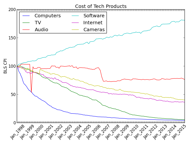
#!/usr/bin/python
import matplotlib.pyplot as plt
with open('cpi','r') as f: # Open file for reading.
    data= [l.strip().split(' ') for l in f] # Make list of lists.
datelabels= [i[0] for i in data]   # Labels in first column.
for i,d in enumerate(datelabels):  # Remove all...
    if (i-1)%12: datelabels[i]= '' # ... but January.
# Data for different plots.
allitems=   [float(i[1]) for i in data]
television= [float(i[2]) for i in data]
software=   [float(i[3]) for i in data]
computers=  [float(i[4]) for i in data]
internet=   [float(i[5]) for i in data]
audio=      [float(i[6]) for i in data]
cameras=    [float(i[7]) for i in data]
# Formatting
plt.title('Cost of Tech Products')
plt.ylabel('BLS CPI')
yN= range(len(datelabels)) # Numeric positions.
plt.xticks(yN,datelabels,rotation=45)
plt.plot(yN,computers,label='Computers')
plt.plot(yN,television,label='TV')
plt.plot(yN,audio,label='Audio')
plt.plot(yN,software,label='Software')
plt.plot(yN,internet,label='Internet')
plt.plot(yN,cameras,label='Cameras')
plt.legend(loc='upper left',ncol=2)
#plt.show()
plt.tight_layout()
plt.savefig('cpi.png',format='png',figsize=(8,18),dpi=100)

# Data looks like this:
#Dec_1997 100.0 100.0 100.0 100.0 100.0 100.0 100.0 100.0
#Jan_1998 100.2 99.8 101.8 96.9 97.1 100.2 99.4 99.9
#Source:https://www.bls.gov/opub/ted/2015/\
#->  long-term-price-trends-for-computers-tvs-and-related-items.htm
Some Features I’ve Used
-
plt.axes - Useful for setting
aspect="equal". -
plt.axis - Range of axes.
-
plt.axhline - Draws a horizontal line through the plot at the specified position. Good for putting origin lines at 0.
-
plt.axvline - Draws a vertical line through the plot at the specified position. Good for putting origin lines at 0.
-
plt.fill_between - Colors the plot between a specified range, for example, everything below your function.
-
plt.grid - Show grid lines on the plot.
-
plt.xlim - Define the X min and max plotting range.
-
plt.ylim - Define the Y min and max plotting range.
-
plt.xticks - Takes a list that represents where ticks go on X axis.
-
plt.yticks - Takes a list that represents where ticks go on Y axis.
-
plt.polar - Create a circular polar plot.
-
plt.scatter - Create a scatter plot.
-
plt.plot - Create a data line plot.
-
plt.saveconfig(filename.svg,formate="svg") - Also "png".
-
plt.show - Send to interactive window. Erases the plt object, so do this last.
-
matplotlib.image.imsave(FILENAME,image_array) - Save image files.