The Sign Painter Problem
:date: 2020-04-26 16:26 :tags:
I sometimes find it helpful and fun to make up my own custom English language idioms. For example, I've coined the Tesla Paradox and the Toaster Problem. Today I'm going to explain what I mean by The Sign Painter Problem.
I've travelled the world on a bicycle which is slow enough that you can get a pretty good look at things. And one day while out on some expedition in some anonymous small town, I rode by a sign shop. What was special about this sign shop was the poor quality of its signage.
That is almost unremarkable. Certainly no one but me and perhaps some conscientious sign painters ever think about this. But stop for a moment and give it some thought.
It is a bad sign when the sign shop has a bad sign.
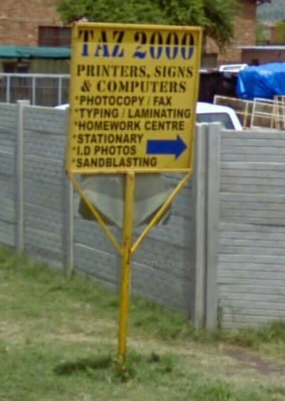
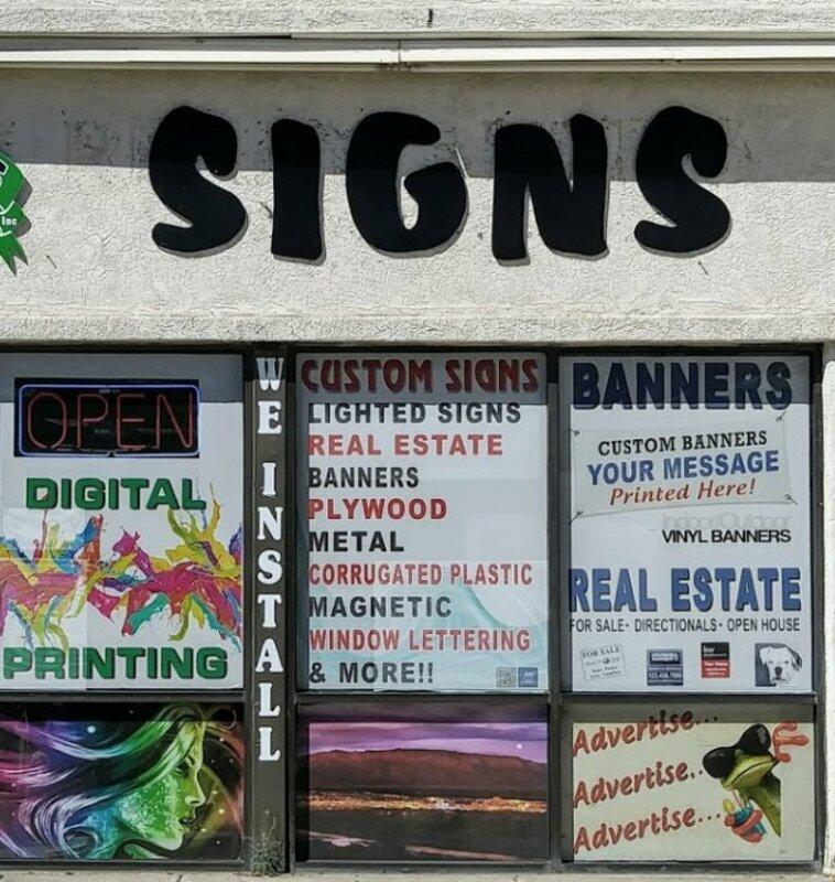
I didn't record the sign business that first prompted me to think about this. But I just did a quick street view search and was able to come up with these examples.

Ok, I've seen worse. However, I'm not giving sympathy points for poor areas — all the other sign shops I found in Africa showed the obvious professionalism one would expect from a professional sign shop. Really, it's actually hard to find bad signage on a sign shop for the obvious reasons you'd expect.

This one is starting to age which makes me wonder, just how much trouble is it for them to put a new one up?

This one is not impressing me with their ability to impress me with signs.

Same here. It's as if it's a sign removal shop.

It doesn't bother the owner of this sign business that the signage of the previous business is still visible on the stucco?

This one is neat and clean and they smartly put their branding on their mailbox, but that's it? Couldn't muster a sign for their sign business?

This one seems not so bad and maybe they got unlucky with the timing, but if I came to work at my sign shop and one of my signs was advertising "I'm not secured very well!", I would stop what I had planned until that was fixed.
All of these are better than the worst ones I've actually seen in real life, but the fact remains — if your business is to impress people with signage, you better impress me with your signage!
Why is "the sign painter problem" a handy concept to have on hand? Well, consider my recent post where I tried to be as brutal as I could be towards Google for their utterly stupid remote work policy. The stupid part, besides being about 20 years late, is that Google makes remote collaboration tools. It is literally their business to use computers in a location invariant way! If they can't get it right for their own employees, why the hell would we think they have a clue for the rest of the world?
You might have heard the expression "eating one's own dogfood" and feel it suffices. But there is a subtle difference. For me, the makers of a military jet's ejection system eat their own dogfood if they go and bail out in it. Yes, they'd assure us, it works. But they'd have the sign painter problem if they made office chairs but, for some inexplicable reason, failed to sit in them while working. Eating one's own dogfood is an extraordinary step to assure customers that their usage (presumably feeding it to their dogs) will go well. The sign painter problem is simply needing to do what the business would reasonably do for any of their customers.
What got me thinking about this today is I came across an announcement about Oculus Connect 7, some kind of virtual reality conference. In the same blog post that I decry Google's inability to accept the use case for their own product, I also mention that in a time of unimagined physical isolation, virtual reality enthusiasts really couldn't have been given a nicer gift. And yet we have the Oculus VR community sad that they can't meet in person in non-virtual reality. How can they not turn this into a win? How can they not celebrate the pretext that could comfortably get them doing exactly what one would think they wanted everyone to do all along? If that's how visionary Oculus is, it's a bad sign.
UPDATE 2020-05-20
I just came across a review I wrote for a book called e-Learning and the Science of Instruction: Proven Guidelines for Consumers and Designers of Multimedia Learning.
A brilliant practical joke! Amazing! 5.0 out of 5 stars - Reviewed in the United States on February 14, 2013 This is perhaps the greatest and most ingenious hoax since Alan Sokal. It is definitely the most labor intensive hoax I have ever seen. The pranksters who created this masterpiece painstakingly fabricated over 500 completely convincing pages to give this parody a completely realistic effect. I can not believe the attention to detail. The authors must be completely ROTFL right now as this book (yes, a real Victorian style book full of dead tree parts!) is now mandatory for many college students trying to learn how to effectively use the more obvious and ubiquitous contemporary communications technologies. I'm sure the $50 price tag is well worth it for them to enjoy this brilliant parody. I feel so square using a web site to write this review. I feel like I should pull a feather out of a goose's bottom and dip it in an ink pot to write this on vellum. Or maybe cast some lead type and make a handbill. Or have a town crier pronounce my delight. I think the authors should make a web site teaching people how to write dead tree how-to books that people will buy. Hilarious! Brilliant!